Scotland's People Annual Report: Results from 2011 Scottish Household Survey
A National Statistics publication for Scotland, providing reliable and up-to-date information on the composition, characteristics, behaviour and attitudes of Scottish households and adults across a number of topic areas including local government, neighbourhoods and transport.
11 Local Services
Introduction and context
Public services, many of which are delivered at local level, are of great importance to the people of Scotland. The quality of these services is crucial to the shaping of a flourishing, productive and equitable Scotland. Local public services are changing to respond to the social, demographic and economic challenges of the twenty-first century. Scotland's 32 local authorities work closely with other organisations (through Community Planning Partnerships) to plan and deliver a wide range of services that improve the lives of people living in their areas.
As part of the National Performance Framework, which is supported by local councils, one of the Scottish Government's national outcomes is that 'our public services are high quality, continually improving, efficient and responsive to local people's needs'.[78] There are also two National Indicators relating to public services: 'improve people's perceptions of the quality of public services' (National Indicator 33) and 'improve the responsiveness of public services' (National Indicator 34). Progress on these two indicators is monitored using data from the Scottish Household Survey (SHS). Many local authorities also use the SHS to assess progress towards their Single Outcome Agreements (a statement of the outcomes that they want to see for their local area).
This chapter begins by exploring satisfaction with the quality of local services and attitudes to involvement in local decision making. It then reports respondents' views on local authority performance and convenience of local services. This chapter also looks in more detail at household recycling levels and use of council run parks and open spaces, as examples of specific services or amenities that are provided at local level.
Main Findings
- In 2011, 66% of adults were satisfied with three public services: local health services, schools and public transport. The corresponding figure in 2007 (the first year this data was collected) was 57%.
- Just over two-fifths (22%) of adults agreed that they can influence decisions affecting their local area and 36% said they would like to be more involved in the decisions their council makes.
- Generally, older adults are more likely than younger adults to say they are satisfied with local government performance and less likely to want to be more involved in making decisions. Adults in higher income households are more likely to want to be involved in decisions that affect the local area than those from lower income households.
- Adults who live in rural areas are less likely to say local services would be convenient to access than those in small towns and urban areas. This was particularly the case for public transport, dentists and chemists/pharmacists.
- Almost nine-in-ten households have recycled some paper (including newspaper, magazines and cardboard), glass jars and bottles, metal cans or plastic bottles in the past month (89%), an increase of 3 percentage points compared to 2010.
- Recycling of these items is clearly related to the type of property in which households live, reflecting the differing availability of recycling services to residents in different types of property. For example, 94% of households living in a house or bungalow recycle one or more of these items compared with up to 80% for those living in flats. Within flats, fewer of those living on the higher floors recycle items: 49% of households living in a flat with the lowest floor level being the fifth floor or higher.
- Over half of adults (56%) in Scotland have access to a useable greenspace (apart from their own garden) that they could walk to within five minutes (13% would have to walk more than 10 minutes). Adults who live less than a five minute walk from useable greenspace are four times more likely to use it every day or several times a week than those who live more than a ten minute walk from useable greenspace (44% versus 11%). Those who use their local greenspace every day or several times a week are considerably more likely to say that their health is good or very good than those who never use their local greenspace (81% versus 63%).
- Around 15% of adults have either not used council run parks and open spaces in the past year or have never used them. More than two-thirds of adults are satisfied with council run parks and open spaces (70%), with around one-in-twenty (6%) being dissatisfied.
Local service quality
The Scottish Government's National Indicator to 'improve people's perceptions of the quality of public services' is measured by the percentage of adults who say they are (very or fairly) satisfied with three public services: local health services, schools and public transport. In 2011, 66% of adults said they were very or fairly satisfied with these services (Table 11.1). The position on this indicator has improved by 9 percentage points in five years: in 2007, 57% of adults said they were very or fairly satisfied with all three local services.
Looking at the services individually, adults tend to be most satisfied with local health services, followed by local schools and public transport. In 2011, 88% of adults were satisfied with local health services, compared to 76% who were satisfied with public transport.
Table 11.1: Percentage of people very or fairly satisfied with the quality of public services delivered (local health services, local schools and public transport) by year
Percentages, 2007-2011 data
| Adults | 2007 | 2008 | 2009 | 2010 | 2011 |
|---|---|---|---|---|---|
| Local health services | 81 | 85 | 86 | 86 | 88 |
| Local Schools | 79 | 81 | 83 | 83 | 85 |
| Public Transport | 69 | 73 | 75 | 74 | 76 |
| % satisfied with all three services* | 57 | 62 | 65 | 64 | 66 |
| Base | 10,083 | 9,156 | 9,627 | 8,950 | 9,606 |
* Percentages reported for all three services combined are of those for which an opinion was given.
This question is only asked of three-quarters of the sample.
Involvement in local decision making
The Commission on the Future Delivery of Public Services report (2011)[79] highlighted the importance of ensuring that our public services are built around people and communities. The National Performance Framework also includes a National Indicator which aims to 'improve the responsiveness of public services'. This is measured as the percentage of adults in the SHS who agree that they can influence decisions affecting their local area. Typically, just over one in five adults agree with this statement (Table 11.2). The figure has increased slightly from 20% in 2007 to 23% in 2011.
Table 11.2: Percentage of people who agree with the statement 'I can influence decisions affecting my local area' by year
Percentages, 2007-2011 data
| Adults | 2007 | 2008 | 2009 | 2010 | 2011 |
|---|---|---|---|---|---|
| Can influence decisions | 19.6 | 21.7 | 21.8 | 21.3 | 22.5 |
| Base | 10,225 | 9,246 | 9,709 | 9,020 | 9,664 |
This question is only asked of three-quarters of the sample.
The proportion of adults who agree that they would like greater involvement in the decisions affecting their local area tends to be higher than those who perceive they can influence them. In 2011, 36% of adults said they would like to be more involved in the decisions their council makes that affects their local area, compared to 22% who felt they can influence decisions affecting their local area (Figure 11.1). In 2011, just under a quarter (23%) of adults agreed that their council is good at listening to local people's views before it takes decisions.
Perceptions of local authority services and performance
Figure 11.1 shows the percentage of adults who agreed (strongly or slightly) with a number of other statements about different aspects of their local authority's performance. The highest level of agreement was almost half (49%) who said their council is good at letting people know about the kinds of services it provides. The lowest level of agreement were with statements about being able to influence decisions and the council being good at listening to local people's views, which are discussed above.
Figure 11.1: Percentage agreeing with various statements about local authority services and performance
2011 data, Adults (base: 9,696)

This question is only asked of three-quarters of the sample.
Table 11.3 shows there are some differences by age group in agreement with statements about local authority services and performance. Generally, older adults are more likely than younger adults to say they are satisfied with the performance statements about local government services and less likely to want to be more involved in making decisions. The strongest desire to participate in local decision-making was shown by those aged 25 to 34, with around 44% of this group saying they would like to have greater involvement with decisions affecting their local area.
Table 11.3: Percentage agreeing with various statements about local council services by age
Percentages, 2011 data
| Adults | 16 to 24 | 25 to 34 | 35 to 44 | 45 to 59 | 60 to 74 | 75 plus | All |
|---|---|---|---|---|---|---|---|
| My local council is good at letting people know about the kinds of services it provides | 40 | 44 | 47 | 48 | 56 | 58 | 49 |
| My local council provides high quality services | 40 | 40 | 42 | 41 | 48 | 57 | 44 |
| My council is good at letting local people know how well it is performing | 27 | 32 | 39 | 42 | 49 | 52 | 40 |
| My local council designs its services around the needs of the people who use them | 37 | 38 | 38 | 36 | 43 | 47 | 39 |
| My local council does the best it can with the money available | 30 | 31 | 37 | 39 | 46 | 52 | 39 |
| My local council is addressing the key issues affecting the quality of life in my local neighbourhood | 28 | 30 | 32 | 33 | 40 | 44 | 34 |
| My council is good at listening to local people's views before it takes decisions | 19 | 21 | 23 | 22 | 26 | 32 | 23 |
| I can influence decisions affecting my local area | 22 | 23 | 22 | 23 | 23 | 18 | 22 |
| I would like to be more involved in the decisions my council makes that affect my local area | 33 | 44 | 42 | 40 | 30 | 14 | 36 |
| Base | 761 | 1,278 | 1,547 | 2,420 | 2,390 | 1,268 | 9,664 |
Columns add to more than 100% since multiple responses allowed.
This question is only asked of three-quarters of the sample.
Table 11.4 examines differences in agreement with statements about local authority performance by net annual household income. Adults in households with incomes of £20,000 or less were slightly more likely to agree with the majority of these statements than adults in households in higher household income bands. The notable exceptions were the statements around being involved in decisions that affect the local area, where those in the higher income groups were most likely to agree. For example, a quarter (25%) of adults with a household income of between £6,001 and £10,000 said they would like to be more involved in council decision-making, rising to 44% of those earning £40,001 or more.
Table 11.4: Percentage agreeing with various statements about local council services by net annual household income
Percentages, 2011 data
| Adults | £0 - £6,000 | £6,001 - £10,000 | £10,001 -£15,000 | £15,001 - £20,000 | £20,001 - £25,000 | £25,001 - £30,000 | £30,001 - £40,000 | £40,001+ | All |
|---|---|---|---|---|---|---|---|---|---|
| My local council is good at letting people know about the kinds of services it provides | 49 | 51 | 47 | 50 | 46 | 50 | 50 | 47 | 49 |
| My local council provides high quality services | 43 | 49 | 45 | 46 | 39 | 41 | 41 | 43 | 44 |
| My council is good at letting local people know how well it is performing | 39 | 43 | 44 | 44 | 37 | 41 | 37 | 38 | 40 |
| My local council designs its services around the needs of the people who use them | 40 | 43 | 40 | 41 | 37 | 37 | 37 | 38 | 39 |
| My local council does the best it can with the money available | 41 | 44 | 42 | 40 | 34 | 38 | 37 | 35 | 39 |
| My local council is addressing the key issues affecting the quality of life in my local neighbourhood | 37 | 37 | 35 | 36 | 32 | 34 | 32 | 32 | 34 |
| My council is good at listening to local people's views before it takes decisions | 28 | 28 | 26 | 24 | 21 | 22 | 23 | 19 | 23 |
| I can influence decisions affecting my local area | 21 | 20 | 21 | 20 | 21 | 24 | 25 | 26 | 22 |
| I would like to be more involved in the decisions my council makes that affect my local area | 31 | 25 | 30 | 33 | 39 | 40 | 42 | 44 | 36 |
| Base | 517 | 1,216 | 1,910 | 1,456 | 1,149 | 819 | 1,133 | 1,151 | 9,351 |
Columns add to more than 100% since multiple responses allowed.
This question is only asked of three-quarters of the sample.
Household income in the SHS is that of the highest income householder and their partner only. Includes all adults for whom household income is known or has been imputed. Excludes refusals/don't know responses.
Table 11.5 looks at differences in agreement with statements about local authority performance by the level of deprivation of the area, as defined using the Scottish Index of Multiple Deprivation (SIMD)[80] and divided into quintiles. The levels of agreement for 'my local council provides high quality services' and 'my local council is good at letting people know about the kinds of services it provides' were lower in the 20% most deprived areas. In the most deprived areas, 38% of adults agreed that services were high quality, compared with 49% in the least deprived areas. Meanwhile, 45% agreed that their council is good at letting them know about services provided, compared to 53% in the least deprived areas. Perceptions of being able to influence decisions and the desire to be involved in decision-making did not show a consistent pattern of differences by level of deprivation.
Table 11.5: Percentage agreeing with various statements about local council services by Scottish Index of Multiple Deprivation
Percentages, 2011 data
| ← 20% most deprived | 20% least deprived → | |||||
|---|---|---|---|---|---|---|
| Adults | 1 | 2 | 3 | 4 | 5 | All |
| My local council is good at letting people know about the kinds of services it provides | 45 | 48 | 45 | 51 | 53 | 49 |
| My local council provides high quality services | 38 | 41 | 43 | 46 | 49 | 44 |
| My council is good at letting local people know how well it is performing | 41 | 40 | 38 | 42 | 41 | 40 |
| My local council designs its services around the needs of the people who use them | 37 | 38 | 38 | 40 | 43 | 39 |
| My local council does the best it can with the money available | 37 | 39 | 38 | 39 | 39 | 39 |
| My local council is addressing the key issues affecting the quality of life in my local neighbourhood | 32 | 34 | 31 | 36 | 37 | 34 |
| My council is good at listening to local people's views before it takes decisions | 24 | 24 | 21 | 23 | 25 | 23 |
| I can influence decisions affecting my local area | 21 | 22 | 22 | 24 | 24 | 22 |
| I would like to be more involved in the decisions my council makes that affect my local area | 36 | 36 | 34 | 36 | 37 | 36 |
| Base | 1,825 | 2,074 | 2,110 | 2,002 | 1,644 | 9,655 |
Columns add to more than 100% since multiple responses allowed.
This question is only asked of three-quarters of the sample.
Table 11.4 and Table 11.5 reveal slightly different results when looking at views on council services by two different measures of disadvantage (household income and area based deprivation as measured by the SIMD). Overall, adults in lower income households were more likely to view council services more positively than those in higher income groups, while the reverse is true for those in more deprived areas. It is not known why this is the case, but it is important to note that the SIMD measures deprivation and not affluence, so income alone offers a different perspective. The approach used within the SIMD assumes that there are a number of different aspects that all contribute to deprivation.
Convenience of Services
The SHS asks adults how convenient or inconvenient they would find it to make use of a selected range of local services during their normal opening hours, assuming they needed to. With the exception of hospital outpatients, at least three-quarters (74%) of adults surveyed said they would find the services (very or fairly) convenient if they needed to use them (Figure 11.2). Over nine-in-ten (93%) said they would find shopping for small amounts of food convenient, which was the highest percentage for any of the services. The lowest percentage of adults (61%) said they would find hospital outpatient services convenient.
Figure 11.2: Percentage who would find various local services very or fairly convenient
2011 data, Adults (base: 9,684)

This question is only asked of three-quarters of the sample.
Table 11.6 shows that adults who live in rural areas[81] were less likely to say services would be convenient to access than those in small towns and urban areas. This was particularly the case for public transport, with 55% of adults in remote rural areas saying they would find public transport convenient to access, compared with 93% of those in large urban areas. A much higher proportion of adults in urban areas also said dentists and chemists were convenient compared to those in remote rural areas.
Table 11.6: Percentage finding services very or fairly convenient by Urban Rural Classification
Percentages, 2011 data
| Adults | Large urban areas | Other urban areas | Accessible small towns | Remote small towns | Accessible rural | Remote rural | Scotland |
|---|---|---|---|---|---|---|---|
| Small amount of grocery or food shopping | 95 | 94 | 94 | 93 | 87 | 85 | 93 |
| Chemist/pharmacist | 91 | 90 | 93 | 92 | 76 | 69 | 88 |
| Cash machine or ATM | 89 | 88 | 90 | 92 | 71 | 71 | 86 |
| Public transport | 93 | 90 | 87 | 82 | 63 | 55 | 85 |
| Doctors surgery | 84 | 84 | 91 | 87 | 78 | 80 | 84 |
| Post office | 82 | 84 | 90 | 90 | 77 | 79 | 83 |
| Petrol station | 75 | 81 | 73 | 85 | 66 | 70 | 76 |
| Dentist | 78 | 79 | 79 | 77 | 59 | 54 | 75 |
| Banking services | 75 | 77 | 75 | 88 | 62 | 61 | 74 |
| Hospital outpatient department | 64 | 63 | 49 | 70 | 56 | 45 | 61 |
| Base | 3,397 | 2,936 | 814 | 559 | 1,056 | 921 | 9,683 |
This question is only asked of three-quarters of the sample.
Recycling
The next section of this chapter discusses the recycling of a range of household waste items, firstly across Scotland as a whole and over time, then in more detail by different types of car access, accommodation, tenure, household type and area deprivation.
Figure 11.3: Percentage recycling each item in the past year
2011 data, Households (base: 10,777)

Figure 11.3 shows the percentage of households that reported recycling waste items in the previous month in 2011. Recycling services are used by the majority (89%) of households in Scotland. Households are typically more likely to recycle newspapers, magazines, paper and cardboard (84%), though there are still high recycling rates for the other items which also show increases of at least 3 percentage points compared to 2010.
Table 11.7 shows the percentage of households recycling at least some of the different types of waste has increased considerably since 2003, and continues to increase year-on-year. These increases may in part be linked, among other things, to the increase in recycling services over that period as well as changing behaviours and attitudes of individuals. All items have seen considerable increases in recycling rates since 2003, with recycling of plastic bottles increasing from 12% in 2003 to 78% in 2011. Overall recycling rates of increased by 5 percentage points over the past five years to just under nine in ten households recycling at least one of the items.
Table 11.7: Percentage recycling items in the past month by year
Percentages, 2003-2011 data
| Households | 2003 | 2004 | 2005 | 2006 | 2007 | 2008 | 2009 | 2010 | 2011 |
|---|---|---|---|---|---|---|---|---|---|
| Newspaper / magazine / paper / cardboard | 45 | 53 | 69 | 76 | 81 | 83 | 84 | 84 | 84 |
| Glass bottles and jars | 35 | 39 | 50 | 57 | 67 | 70 | 73 | 76 | 78 |
| Metal cans | 14 | 20 | 37 | 48 | 59 | 65 | 69 | 73 | 75 |
| Plastic bottles | 12 | 19 | 36 | 46 | 58 | 65 | 71 | 74 | 78 |
| One or more of the above | 55 | 61 | 75 | 80 | 84 | 87 | 88 | 88 | 89 |
| Base | 11,185 | 15,941 | 15,393 | 15,616 | 11,331 | 10,369 | 11,039 | 10,313 | 10,777 |
Columns add to more than 100% since multiple responses allowed.
This question is only asked of three-quarters of the sample.
In previous years the questions asked whether or not the household recycled each of four items (yes or no). In 2007 this was changed to how much (all/most/some/none) was recycled. There was also a change to the items 'glass bottles' became 'glass bottles and jars' and 'plastic' became 'plastic bottles'.
The relationship between recycling and access to a car is explored in Table 11.8. Households with access to at least one car are considerably more likely to recycle one or more of the items compared to households without access to cars (93% and 79% respectively). While the same is true for the individual waste items, the biggest difference between households with and without access to cars relates to the recycling of glass bottles and jars (21 percentage points difference).
Table 11.8: Percentage recycling items in the past month by access to a car
Percentages, 2011 data
| Households | Access to a car | No access to a car | All |
|---|---|---|---|
| Newspaper / magazine / paper / cardboard | 89 | 73 | 84 |
| Glass bottles and jars | 85 | 64 | 78 |
| Metal cans | 80 | 62 | 75 |
| Plastic bottles | 83 | 66 | 78 |
| One or more of the above | 93 | 79 | 89 |
| Base | 7,666 | 3,111 | 10,777 |
Columns add to more than 100% since multiple responses allowed.
This question is only asked of three-quarters of the sample.
Recycling of the items is clearly related to the type of property in which households live, reflecting the differing availability of recycling services to residents in different types of property (Table 11.9). For example, 94% of households living in a house or bungalow recycle one or more of these items compared with up to 80% for those living in flats. Within flats, fewer of those living on the higher floors recycle items. In particular, for those households in living in the 5th floor or higher the recycling rates drop to less than half (49%) recycling at least one of the items in the past month.
The same relationship is true for the individual waste items between accommodation types; households living in houses or bungalows recycle the most followed by those in flats on the ground floor and lastly by those in flats on higher floors. The relationship between household waste items within accommodation types remains broadly the same regardless of accommodation type; for example newspapers and similar materials are the most recycled household waste items in houses or bungalows and flats irrespective of floor level.
Table 11.9: Percentage recycling items in the past month by accommodation type
Percentages, 2011 data
| Flat | ||||||||
|---|---|---|---|---|---|---|---|---|
| Households | House or bungalow | Ground floor/4-in-a-block | 1st floor or basement | 2nd floor | 3rd/4th floor | 5th floor or higher | Other | All |
| Newspaper / magazine / paper / cardboard | 91 | 74 | 74 | 64 | 61 | 44 | * | 84 |
| Glass bottles and jars | 86 | 67 | 64 | 59 | 62 | 41 | * | 78 |
| Metal cans | 82 | 65 | 61 | 51 | 52 | 33 | * | 75 |
| Plastic bottles | 84 | 70 | 68 | 63 | 62 | 41 | * | 78 |
| One or more of the above | 94 | 80 | 80 | 74 | 71 | 49 | * | 89 |
| Base | 7,433 | 1,435 | 1,101 | 411 | 254 | 107 | 36 | 10,777 |
The 'All' category includes households living in caravans or other accommodation
Columns add to more than 100% since multiple responses allowed.
This question is only asked of three-quarters of the sample.
Table 11.10 shows the percentage of households recycling at least some of each waste item, and of at least one of them, according to whether they own or rent their accommodation.
Given the relationship between accommodation type and recycling seen previously and the fact that there are links between type of accommodation and tenure, it would be expected that variations in recycling by tenure might reflect variations in type of accommodation. It can be seen from Table 11.10 that owner occupiers, the majority of whom live in houses or bungalows, are more likely to recycle (for example, well over nine in ten owner occupiers recycle one or more items as opposed to around three quarters of renters). Levels of recycling are similar between renters from the social and private rented sectors. Those in the private rented sector are more likely to recycle at least one of the items compared to those from the social rented sector (80% and 77% respectively).
Table 11.10: Percentage recycling items in the past month by tenure of household
Percentages, 2011 data
| Households | Owner occupied | Social rented | Private rented | Other | All |
|---|---|---|---|---|---|
| Newspaper / magazine / paper / cardboard | 90 | 72 | 72 | 73 | 84 |
| Glass bottles and jars | 86 | 62 | 69 | 66 | 78 |
| Metal cans | 81 | 62 | 61 | 65 | 75 |
| Plastic bottles | 84 | 66 | 69 | 65 | 78 |
| One or more of the above | 94 | 77 | 80 | 80 | 89 |
| Base | 7,110 | 2,428 | 1,063 | 176 | 10,777 |
Columns add to more than 100% since multiple responses allowed.
This question is only asked of three-quarters of the sample.
Recycling also varies according to household type (Table 11.11). A lower percentage of single adult (78%) and single parent households (82%) recycle than does any other household type. This is likely to be linked to the type of tenure and the associated accommodation type of these households.
Table 11.11: Percentage recycling items in the past month by household type
Percentages, 2011 data
| Households | Single adult | Small adult | Single parent | Small family | Large family | Large adult | Older smaller | Single pensioner | All |
|---|---|---|---|---|---|---|---|---|---|
| Newspaper / magazine / paper / cardboard | 71 | 85 | 77 | 87 | 88 | 89 | 92 | 85 | 84 |
| Glass bottles and jars | 67 | 81 | 68 | 82 | 83 | 84 | 86 | 75 | 78 |
| Metal cans | 61 | 75 | 68 | 79 | 84 | 81 | 82 | 72 | 75 |
| Plastic bottles | 66 | 80 | 74 | 84 | 86 | 84 | 84 | 74 | 78 |
| One or more of the above | 79 | 91 | 82 | 91 | 92 | 93 | 94 | 87 | 89 |
| Base | 1,749 | 1,784 | 580 | 1,374 | 655 | 1,052 | 1,847 | 1,736 | 10,777 |
Columns add to more than 100% since multiple responses allowed.
This question is only asked of three-quarters of the sample.
Older smaller households report the highest levels of recycling overall; for example, over nine in ten (94%) recycle at least one item and a similar proportion (92%) recycles newspapers and other pulp products. Once again this is likely to be linked to accommodation type and tenure of such households. Large families report the highest levels of recycling plastic bottles (around 86%), which may be related to usage of that type of product, although this is not covered in the SHS.
Table 11.12 looks at the percentage of household recycling at least one item of waste by both accommodation type and household type. For each household type, a higher percentage of those living in houses or bungalows recycle compared with those living in flats. Much of the difference between household types shown in Table 11.11 can be explained by the different types of accommodation type they live in. However, older smaller families are most likely to recycle at least one item (96% of those in a house or bungalow for example)
Table 11.12: Percentage of households recycling one or more items in the past month by household type and accommodation type
Percentages, 2011 data
| Households | House or bungalow | Flat or maisonette | Other | All | Base |
|---|---|---|---|---|---|
| Single adult | 92 | 71 | * | 79 | 1,749 |
| Small adult | 95 | 83 | * | 91 | 1,784 |
| Single parent | 91 | 71 | * | 82 | 580 |
| Small family | 94 | 79 | * | 91 | 1,374 |
| Large family | 95 | 77 | * | 92 | 655 |
| Large adult | 96 | 79 | * | 93 | 1,052 |
| Older smaller | 96 | 86 | * | 94 | 1,847 |
| Single pensioner | 91 | 81 | * | 87 | 1,736 |
| All | 94 | 78 | * | 89 | |
| Base | 7,433 | 3,308 | 36 | 10,777 |
The 'All' category includes households living in caravans or other accommodation
Columns add to more than 100% since multiple responses allowed for items being recycled.
This question is only asked of three-quarters of the sample.
Table 11.13 shows how recycling varies across accommodation type by area deprivation. The percentage of households recycling at least one waste item increases as the level of area deprivation decreases, from 79% of households living in the 20% most deprived datazones to 96% of households living in the 20% least deprived datazones.
Table 11.13: Percentage of households recycling one or more items in the past month by accommodation type and Scottish Index of Multiple Deprivation
Percentages, 2011 data
| ← 20% most deprived | 20% least deprived → | ||||||
|---|---|---|---|---|---|---|---|
| Households | 1 | 2 | 3 | 4 | 5 | Scotland | Base |
| House or bungalow | 91 | 93 | 93 | 95 | 98 | 94 | 7,428 |
| Flat or maisonette | 70 | 78 | 82 | 82 | 87 | 78 | 3,303 |
| Other | * | * | * | * | * | * | 36 |
| All | 79 | 87 | 89 | 92 | 96 | 89 | |
| Base | 2,038 | 2,316 | 2,311 | 2,226 | 1,876 | 10,767 | |
The 'All' category includes households living in caravans or other accommodation
Columns add to more than 100% since multiple responses allowed for items being recycled.
This question is only asked of three-quarters of the sample.
Greenspace
Access to good quality greenspace is associated with higher levels of physical activity and improved quality of life, including better health and wellbeing. Other research has also shown that being very satisfied with the quality of your local greenspace is associated with higher life satisfaction, greater social trust and a higher sense of community cohesion.[82] The impacts of greenspace and the wider neighbourhood physical environment on health are recognised in 'Equally Well',[83] the Scottish Government's strategic framework on health inequalities, and in 'Good Places, Better Health'[84] which seeks to improve evidence based policy-making in relation to physical environments and health.
This section starts by looking at the key factors and characteristics associated with greenspace use. Firstly, consideration of how accessible people's nearest local greenspaces are and how this affects how often they use them, as well as the associations between these two factors and self perception of health. The section then looks at the perceptions of council run parks and open spaces, for both frequency of use and peoples' satisfaction with them.
Please note that from January 2011 there were two major changes to the greenspace questions. Previously, the first question related to any greenspace area in the neighbourhood that the householders could use which they considered to be safe and pleasant. This changed to a question on the distance, in walking minutes, to the nearest greenspace.
How far is it to a local greenspace area that you and your family can use? How long would it take me to walk there? [The interviewee is told that for this question, greenspace includes a park, green or other area of grass in their neighbourhood. Leaving aside any private garden space that they might have.]
The follow up question on how often this greenspace was used was retained though the response categories were altered to provide more detail on regular use.
Availability and accessibility of open spaces
A number of Scottish local authorities are working to develop accessibility standards for their open space in line with national planning guidance. In most cases, the accessibility standard is taken to be equivalent to a five minute walk to the nearest usable open space.[85] The SHS asks specifically about greenspace, one type of open space.
Figure 11.4 shows that over half (56%) of adults in Scotland have access to a useable local greenspace that is within a five minute walk from their home. The first part of the chart shows that access to local greenspace differs significantly by area deprivation levels. Less than half (45%) of those living in the 20% most deprived areas of Scotland have access to useable greenspace within a five minute walk, rising to a high of 63% of those in the second least deprived areas. The 20% least deprived areas of Scotland have a higher proportion than any other group saying that their local greenspace is a 5-10 minute walk away (33%). However, those in the most deprived areas are twice as likely as those in the least deprived areas to say that a local greenspace area that they and their family can use is more than a 10 minute walk away (25% versus 13%).
Figure 11.4: How far away (in walking minutes) nearest usable greenspace is by Scottish Index of Multiple Deprivation and rating of neighbourhood as a place to live
2011 data, Adults (base: 9,424; minimum: 150)
 nearest usable greenspace is by Scottish Index of Multiple Deprivation and rating of neighbourhood as a place to live")
This question is asked of three quarters of the sample.
Figure 11.4 also shows that there is an association between access to greenspace and how people rate their neighbourhood as a place to live. Three fifths (59%) of adults who rate their neighbourhood as a very good place to live say they have access to useable greenspace within a five minute walk, compared to less than half (46%) of those rating their neighbourhood as poor. It is not possible to say from this survey data the strength of the influence, if any, that accessibility of greenspace has on rating of neighbourhood. It is likely to be one factor among many influences that are not explored here. Scottish data on what makes somewhere a good place to live are available in the 2009 Scottish Social Attitudes survey.[86]
Frequency of use of greenspace
Overall one third (33%) of adults use their local greenspace either every day or several times a week, broadly similar proportions to those who use them less often (37% in total) or not at all (30%) (Figure 11.5).
Figure 11.5: How often uses nearest usable greenspace
2011 data, Adults (base: 9,587)

This question is asked of three quarters of the sample.
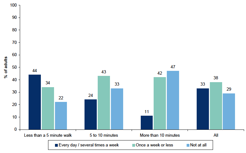
Figure 11.6 shows a strong link between how far people have to walk to reach their local greenspace and how often they use it. Adults who live less than a 5 minute walk from useable greenspace are almost twice as likely to use it every day or several times a week than those who live a 5-10 minute walk away (44% versus 24%), and are four times more likely to use it every day or several times a week than those who live more than a 10 minute walk away (44% versus 11%). Similarly, those who live more than a 10 minute walk from useable greenspace are more than twice as likely to say they never use it than those who live less than a five minute walk away (47% versus 22%).
Figure 11.6: How far away nearest usable greenspace is by how often used
2011 data, Adults (base: 9,394; minimum: 1,700)
Frequency of use of local greenspace differs considerably by area deprivation levels (Figure 11.7). Less than a quarter (23%) of those in the most deprived areas use their local greenspace every day or several times a week, versus 32% in the least deprived areas and 39% in the second least deprived areas. Similarly a quarter (25%) of those in the least and second least deprived areas never use their local greenspace, but this rises to 42% of those in the most deprived areas.
Figure 11.7: How often uses nearest usable greenspace by Scottish Index of Multiple Deprivation
2011 data, Adults (base: 9,580; minimum: 1,688)

This question is asked of three quarters of the sample.
Adults who live in households with children are most likely to use local greenspace frequently (Figure 11.8), with around four-in-ten of small family households (41%) and large family households (38%) using the greenspace at least several times a week. Single pensioner adults are the least likely to use their local greenspace, with over half (51%) saying they never use it and only one in five (12%) using it every day or several times a week. One third of young adults who live alone (single adults) do not use their nearest greenspace at all.
Figure 11.8: How often uses nearest usable greenspace by household type
2011 data, Adults (base: 9,587, minimum: 521)

This question is asked of three quarters of the sample.
Greenspace and health
Table 11.14 shows that those adults who have useable greenspace within a five minute walk from their home are more likely to say their health in general has been very good or good than those whose nearest useable greenspace is more than a ten minute walk away (78% versus 67%). Similarly those whose nearest useable greenspace is more than a ten minute walk away are almost twice as likely as those for whom it is less than five minutes away to say that they their health is bad or very bad (9% versus 5%). Again, it is not possible to say from this data the strength of influence of accessibility to greenspace on health, merely that there is an association. However, separate research has found that people who use greenspace regularly are more likely to be physically active, which in turn can have benefits both on people's physical health and their mental wellbeing[87] and Scottish Government funded research is due to be published later in the year which will explore this further[88].
Table 11.14: How far away nearest usable greenspace is by self perception of health
Row percentages, 2011 data
| Adults | Very good / Good | Fair | Very bad / Bad | Total | Base |
|---|---|---|---|---|---|
| Less than a 5 minute walk | 78 | 17 | 5 | 100 | 5,164 |
| 5 to 10 minutes | 75 | 19 | 5 | 100 | 2,550 |
| More than 10 minutes | 67 | 24 | 9 | 100 | 1,704 |
| All | 75 | 19 | 6 | 100 | 9,418 |
This question is asked of three quarters of the sample.
Table 11.15 shows that those who use their local greenspace every day or several times a week are much more likely to say that their health in general is good or very good than those who don't use it at all (81% versus 63%). Similarly those who never use their local greenspace are almost four times as likely as those who use it every day or several times a week to say their health is bad or very bad (11% versus 3%). Again it is not possible to say from this data whether using greenspace improves health or whether those who are healthy are more likely to use their local greenspace and to what extent bad health may be limiting greenspace use. Again these issues will be explored further in the aforementioned forthcoming Scottish Government funded research.
Table 11.15: How often uses nearest usable greenspace by self perception of health
Column percentages, 2011 data
| Adults | Very good / Good | Fair | Very bad / Bad | Scotland |
|---|---|---|---|---|
| Every day / several times a week | 35 | 27 | 17 | 33 |
| Once a week or less | 39 | 32 | 27 | 37 |
| Not at all | 25 | 41 | 56 | 30 |
| Total | 100 | 100 | 100 | 100 |
| Base | 6,801 | 2,068 | 712 | 9,581 |
This question is asked of three quarters of the sample.
Perceptions of council run parks and open spaces
The analyses above was concerned only with adults nearest useable greenspace. This section presents data specifically on council run parks and open spaces.
Table 11.16 shows use of and satisfaction with council run parks and open spaces by gender and age. The frequency of use of council run parks and open spaces over the past 12 months varies considerably. Adults are most likely to have used such open spaces at least once a week or about once a month (24% and 21% respectively) in the past 12 months, with a fairly even spread across the remaining frequency categories including 15% who have never used them, 14% who have not used them in the past year, 13% who use them once or twice a year, and a further 13% who use them most days.
Table 11.16: Frequency of using and satisfaction with council run parks and open spaces by gender and age
Column percentages, 2011 data
| Adults | Male | Female | 16-24 | 25-34 | 35-44 | 45-59 | 60-74 | 75+ | All |
|---|---|---|---|---|---|---|---|---|---|
| Frequency of use | |||||||||
| Most days | 13 | 13 | 13 | 15 | 14 | 14 | 11 | 5 | 13 |
| At least once a week | 24 | 23 | 26 | 32 | 34 | 19 | 17 | 11 | 24 |
| About once a month | 21 | 21 | 24 | 23 | 24 | 21 | 20 | 12 | 21 |
| Once or twice a year | 13 | 13 | 13 | 13 | 11 | 15 | 13 | 11 | 13 |
| Not used in the past year | 13 | 15 | 10 | 6 | 7 | 15 | 19 | 34 | 14 |
| Never used | 16 | 15 | 14 | 10 | 10 | 16 | 19 | 27 | 15 |
| Don't Know | 0 | 0 | 0 | 0 | 0 | 1 | 0 | 0 | 0 |
| Total | 100 | 100 | 100 | 100 | 100 | 100 | 100 | 100 | 100 |
| Base | 4,198 | 5,466 | 761 | 1,278 | 1,547 | 2,420 | 2,390 | 1,268 | 9,664 |
| Satisfaction | |||||||||
| Satisfied | 70 | 70 | 71 | 76 | 76 | 70 | 68 | 53 | 70 |
| Neither satisfied nor dissatisfied | 6 | 6 | 6 | 4 | 6 | 6 | 6 | 8 | 6 |
| Dissatisfied | 6 | 6 | 7 | 8 | 8 | 6 | 4 | 4 | 6 |
| No opinion | 18 | 18 | 16 | 12 | 11 | 19 | 22 | 35 | 18 |
| Total | 100 | 100 | 100 | 100 | 100 | 100 | 100 | 100 | 100 |
| Base | 4,198 | 5,466 | 761 | 1,278 | 1,547 | 2,420 | 2,390 | 1,268 | 9,664 |
This question is only asked of three-quarters of the sample.
There are a number of variations in use of council run parks and open spaces by age, especially for the older age groups where a third (34%) of those aged 75 and over have not used council run park or open spaces in the past year and over a quarter (27%) say they never use them. Those from the younger age groups, 16 to 44, are the most frequent users of greenspace. In relation to gender, however, there are no variations in the use of and satisfaction with council run parks and open spaces.
Table 11.16 also shows that more than two-thirds of adults are satisfied with council run parks and open spaces (70%), with only 6% being dissatisfied. There are a number of differences in satisfaction with open spaces across different age groups, although these appear likely to be associated with frequency of use. Three quarters (76%) of those aged 25 to 44 are satisfied. The highest levels of dissatisfaction are also expressed by younger age groups, however, the comparatively low levels of both satisfaction and dissatisfaction expressed by those in older age groups can be explained by the higher proportions saying they have no opinion.
Table 11.17 shows that there is some variation in use of council run parks and open spaces when looking at deprivation. There is little difference between those living in the most and least deprived areas in terms of the proportion who use council run parks and open space most days. However those in the least deprived areas are more likely to use them at least once a week (27% versus 23%) or about once a month (26% versus 17%) and less likely to say they never use council run parks and open space (10% versus 18%) than those in the most deprived areas. There is quite a marked difference in level of satisfaction with council run parks and open spaces by deprivation. Just under two thirds of those in the 20% least deprived areas are satisfied with such services (64%), increasing to 78% in the least deprived areas.
Table 11.17: Frequency of using and satisfaction with council run parks and open spaces by Scottish Index of Multiple Deprivation
Column percentages, 2011 data
| ← 20% most deprived | 20% least deprived → | |||||
|---|---|---|---|---|---|---|
| Adults | 1 | 2 | 3 | 4 | 5 | Scotland |
| Frequency of use | ||||||
| Most days | 12 | 13 | 12 | 12 | 13 | 13 |
| At least once a week | 23 | 23 | 22 | 23 | 27 | 24 |
| About once a month | 17 | 21 | 20 | 22 | 26 | 21 |
| Once or twice a year | 13 | 12 | 13 | 14 | 12 | 13 |
| Not used in the past year | 16 | 15 | 15 | 13 | 11 | 14 |
| Never used | 18 | 16 | 18 | 15 | 10 | 15 |
| Don't Know | 1 | 0 | 0 | 0 | 0 | 0 |
| Total | 100 | 100 | 100 | 100 | 100 | 100 |
| Base | 1,825 | 2,074 | 2,110 | 2,002 | 1,644 | 9,655 |
| Satisfaction | ||||||
| Satisfied | 64 | 68 | 67 | 73 | 78 | 70 |
| Neither satisfied nor dissatisfied | 6 | 6 | 7 | 6 | 5 | 6 |
| Dissatisfied | 8 | 7 | 6 | 4 | 4 | 6 |
| No opinion | 22 | 18 | 20 | 17 | 13 | 18 |
| Total | 100 | 100 | 100 | 100 | 100 | 100 |
| Base | 1,825 | 2,074 | 2,110 | 2,002 | 1,644 | 9,655 |
This question is only asked of three-quarters of the sample.
Table 11.18 examines differences in people's use of and satisfaction with council run parks and open spaces by how they rate their neighbourhood as a place to live. Although the majority of people across all neighbourhood rating levels are satisfied with such open spaces, the percentage of those satisfied decreases steadily from seven in ten (73%) for those rating their neighbourhood as a very good place to live to over half (54%) for those saying it is very poor.
There are also variations in people's frequency of using council run parks and open spaces by neighbourhood rating. For example, those who never use such spaces varies from 15% for those rating their neighbourhood as a very good place to live to almost a quarter (23%) for those rating their neighbourhood as very poor.
Table 11.18: Frequency of using and satisfaction with council run parks and open spaces by rating of neighbourhood as a place to live
Column percentages, 2011 data
| Adults | Very good | Fairly good | Fairly poor | Very poor | All |
|---|---|---|---|---|---|
| Frequency of use | |||||
| Most days | 13 | 12 | 11 | 11 | 13 |
| At least once a week | 23 | 24 | 21 | 24 | 24 |
| About once a month | 21 | 22 | 20 | 12 | 21 |
| Once or twice a year | 12 | 14 | 16 | 14 | 13 |
| Not used in the past year | 15 | 13 | 17 | 17 | 14 |
| Never used | 15 | 15 | 15 | 23 | 15 |
| Don't Know | 0 | 0 | 0 | 0 | 0 |
| Total | 100 | 100 | 100 | 100 | 100 |
| Base | 5,728 | 3,354 | 392 | 157 | 9,664 |
| Satisfaction | |||||
| Satisfied | 73 | 68 | 59 | 54 | 70 |
| Neither satisfied nor dissatisfied | 5 | 7 | 8 | 11 | 6 |
| Dissatisfied | 4 | 8 | 13 | 17 | 6 |
| No opinion | 18 | 17 | 21 | 18 | 18 |
| Total | 100 | 100 | 100 | 100 | 100 |
| Base | 5,728 | 3,354 | 392 | 157 | 9,664 |
This question is only asked of three-quarters of the sample.
Table 11.19 shows that those who are satisfied with council run parks and open spaces are more likely to use them, and use them more frequently. Almost half (46%) of those who are satisfied with parks and open spaces use them at least once a week or most days, compared to 36% who are dissatisfied. Those who are dissatisfied with parks and open spaces are twice as likely as those who are satisfied to say they have not used them in the past year (16% versus 7%) or have never used them (10% versus 5%). The proportions who use council run parks and greenspaces about once a month or once or twice a year are very similar between those who are satisfied and dissatisfied with them.
Table 11.19: Frequency of using council run parks and open spaces by satisfaction
Column percentages, 2011 data
| Adults | Satisfied | Neither satisfied nor dissatisfied | Dissatisfied | No opinion | Total |
|---|---|---|---|---|---|
| Most days | 16 | 6 | 12 | 1 | 13 |
| At least once a week | 30 | 12 | 24 | 2 | 24 |
| About once a month | 26 | 16 | 24 | 2 | 21 |
| Once or twice a year | 15 | 14 | 14 | 3 | 13 |
| Not used in the past year | 7 | 32 | 16 | 33 | 14 |
| Never used | 5 | 19 | 10 | 58 | 15 |
| Don't Know | 0 | 0 | 0 | 1 | 0 |
| Total | 100 | 100 | 100 | 100 | 100 |
| Base | 6,625 | 588 | 513 | 1,938 | 9,664 |
This question is only asked of three-quarters of the sample.
Contact
Email: Nic Krzyzanowski
There is a problem
Thanks for your feedback